Why This Smart Redesign Took a Hidden Product to the Spotlight
How Packaging Can Make or Break Your Brand: Lessons from Chase Design Group
Packaging is more than aesthetics—it’s a strategy. Your design needs to solve business problems, whether that’s making an unknown product visible or modernizing a legacy brand without losing its identity.
Shelf visibility is everything. Bold colors, large typography, and clear differentiation help products stand out, especially in crowded or hard-to-find retail spaces like the freezer aisle.
Guide your customers to your product. Sometimes packaging alone isn’t enough—smart brands extend their design strategy to signage, messaging, and marketing to lead consumers to where they need to go.
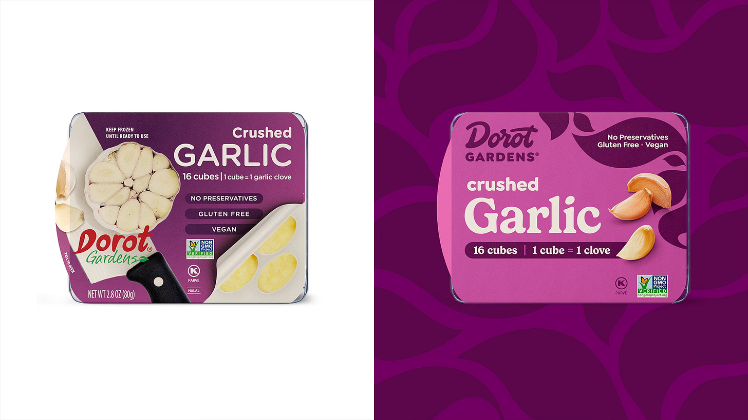
If your packaging isn’t doing the heavy lifting, your product might as well be invisible. That’s exactly what Chase Design Group tackled when redesigning two very different brands—Dorot Gardens, a frozen herb brand struggling to be noticed, and Tombstone Pizza, a classic that needed a refresh without losing its bold personality. The takeaway? Whether you’re launching a new product or rebranding an existing one, design isn’t just about looking good—it’s about solving business problems.
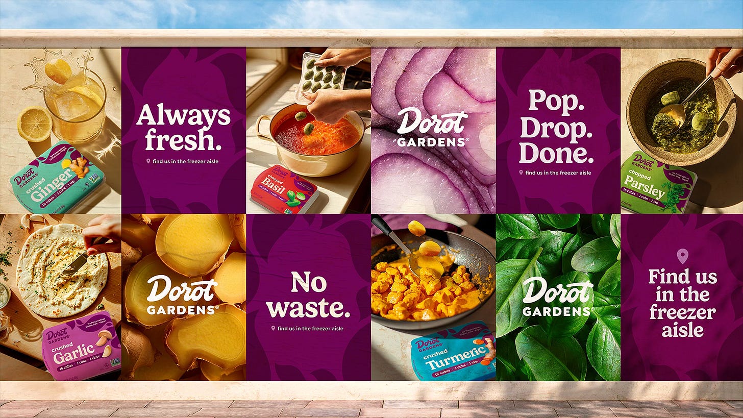
Dorot Gardens had a major challenge: there wasn’t a real category for frozen herbs in grocery stores, meaning consumers didn’t even know to look for it. Chase Design Group had to create visibility where none existed. Their solution? High-contrast colors, large typography, and clear product differentiation so customers could actually tell what they were buying (because let’s be honest, no one wants to accidentally drop frozen garlic into their tea instead of ginger). They also extended the design strategy beyond the packaging, helping the brand create signage and messaging that directed shoppers from the fresh herb section to the freezer.
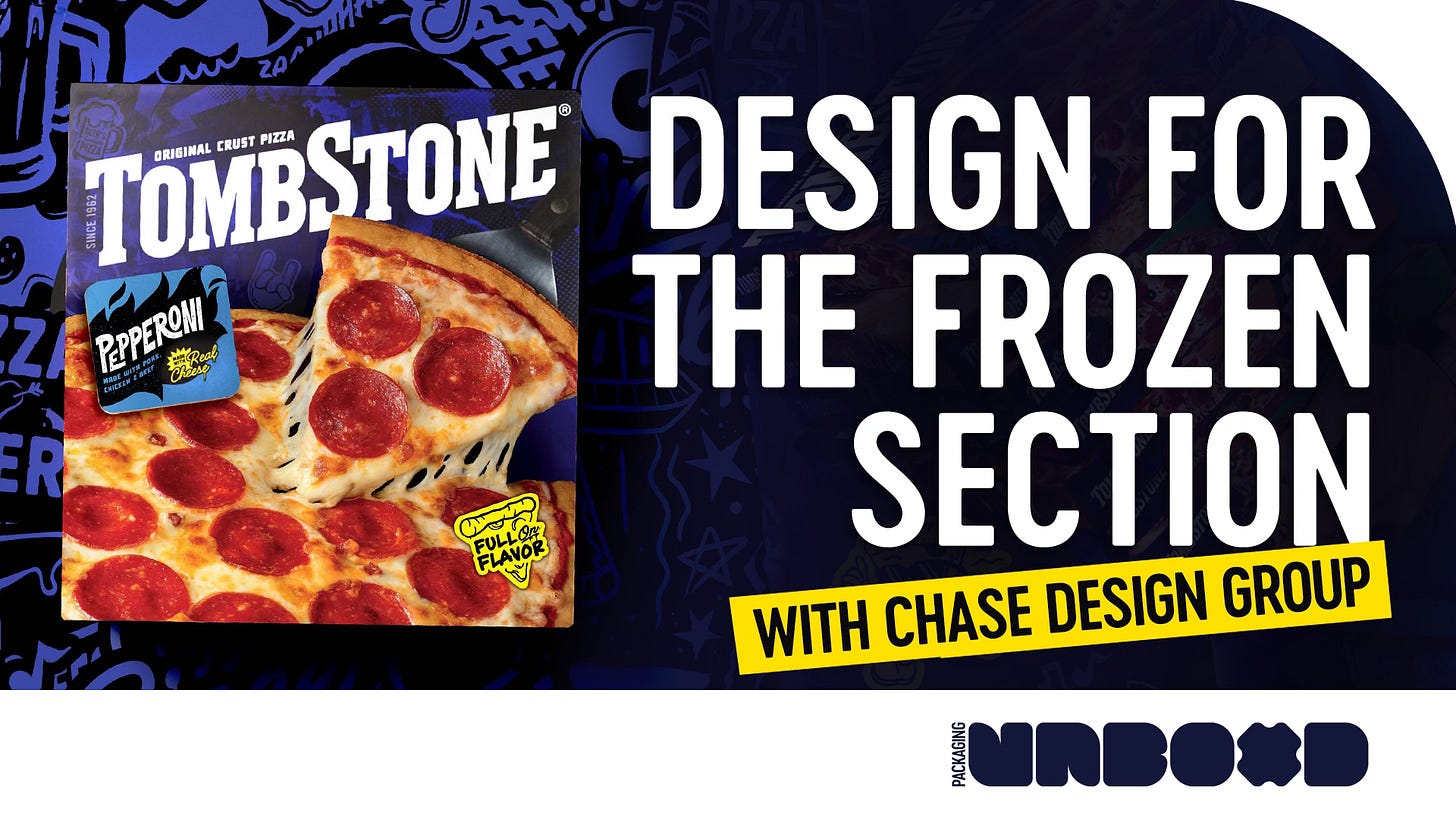
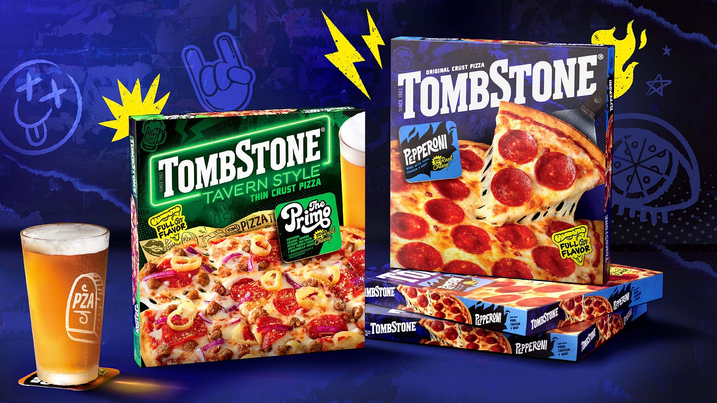
On the other hand, Tombstone Pizza had plenty of recognition, but its design was starting to feel more "forgotten relic" than "bold, classic favorite." The challenge was modernizing the look while keeping the edge that made Tombstone stand out in the first place. The key here was knowing what to keep and what to evolve—something every brand should think about when considering a redesign. Chase Design Group kept the strong, no-nonsense attitude but refined the typography and color blocking to make the brand pop while staying true to its roots.
The biggest lesson? Packaging isn’t just a pretty face—it’s a strategy. It tells consumers what they need to know in seconds, and when done right, it can transform an overlooked product into a category leader. Whether you’re a designer or an entrepreneur, the key is thinking beyond the box (literally) and designing with the entire customer journey in mind. Because if people can’t find your product—or worse, don’t even realize they need it—you’re already losing.


