


The Science of Packaging Design with Fernando Arendar


The Science Behind Effective Food Packaging Design: Insights from Fernando Arendar
Key Takeaways:
Importance of Clarity Over Cleverness: Effective packaging design prioritizes clear communication of product attributes over trendy or complex visuals.
Psychological Impact of Shapes and Colors: Different shapes and colors trigger specific, often subconscious, consumer perceptions and emotional responses.
Balancing Tastefulness and Healthiness: Successful packaging design can simultaneously communicate both the taste appeal and the health benefits of a product.
The Importance of Clarity in Packaging Design
Effective packaging design is more than just eye-catching graphics; it’s about clear and precise communication. Fernando Arendar, founder of Nitid Studio, emphasized the principle of "being clear, not clever" in packaging design. During his conversation with Evelio Mattos, Arendar highlighted the necessity for designers to prioritize clarity to make it easier for consumers to process information.
"The most important learning I have from these theories and insight is to be clear about what we would like to convey in a [product's] packaging," says Arendar.
The focus on clarity over cleverness stems from the observation that consumers prefer packaging that succinctly communicates the product’s primary attributes without requiring excessive mental energy. Clarity ensures that the consumer can instantly discern the product's primary benefits, whether that’s nutritional information, flavor, or use-case, within moments of viewing the packaging.
Using clear and simple design reduces the cognitive load required for consumers, making the product more appealing and easier to trust. This is especially crucial in a crowded marketplace where numerous products vie for the consumer’s attention.
Psychological Impact of Shapes and Colors
One of the most fascinating insights from the conversation between Mattos and Arendar is the psychological impact of colors and shapes on consumer perception. Arendar shared how different visual elements can evoke specific consumer responses, a concept deeply rooted in cross-modal research.
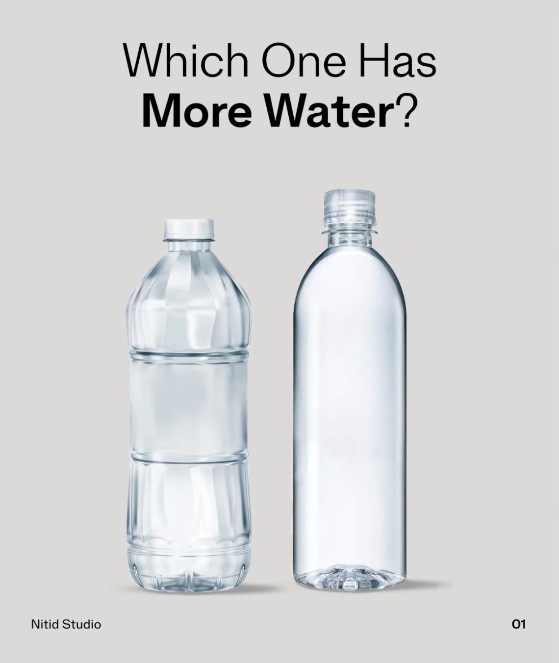
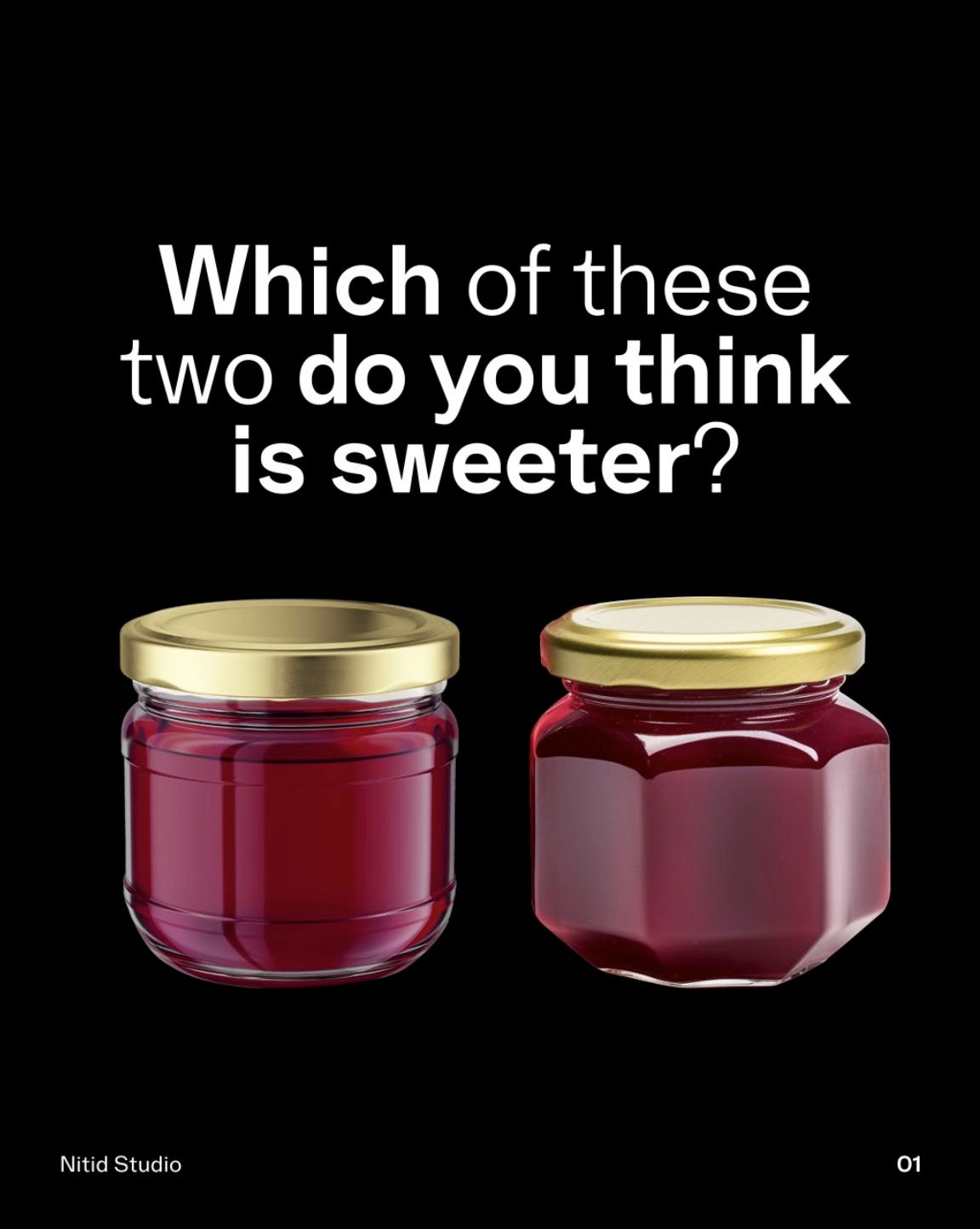
"Round shapes are linked to sweeter flavors," mentioned Arendar. He further explained, "The hypothesis for this is from evolutionary biology—that our ancestors used to understand what type of food is safe, and the type of food that is safe is always round."
This insight highlights how inherent and learned associations can drive consumer behavior. Round and fluid shapes are generally associated with sweet, safe, and pleasant experiences, while angular shapes can be perceived as harsher and less desirable. Similarly, colors like green and orange are often associated with specific flavors due to cultural and evolutionary conditioning.
These associations aren’t just theoretical—they have practical applications in packaging design. For instance, Arendar’s work with Ruani functional brownies leverages round typography and soft shapes to communicate the product’s sweet, indulgent nature while still emphasizing its health benefits through clean and simple design.

Balancing Tastefulness and Healthiness in Design
Packaging for food and beverages often faces the challenge of communicating both taste appeal and health benefits effectively. Arendar’s experience emphasizes the fine balance between these two attributes in achieving successful packaging design.
"The interesting thing is that our brain always try to do shortcuts. It uses past experience, we are not aware of these shortcuts. It’s something like automatic," Arendar elucidates.
In practice, these shortcuts mean that an overly busy or complex design can be counterproductive. For instance, praiseworthy popcorn's redesign by Nitid Studio streamlined the packaging from a busy mix of colors and fonts to a clear, simple design with a single font and minimal elements. This shift not only made the product easier to understand but also positioned it as a healthier and more premium option.
By using bright and clean visuals, designers can make health-oriented products seem more appealing, without undermining their perceived tastefulness. The balance is delicate but can be maintained by focusing on core attributes that need to be communicated most strongly, keeping in mind the psychological cues that consumers respond to.
Reflecting on the broader impacts of these themes reveals a consistent thread: successful packaging design hinges on an astute understanding of consumer psychology. Clarity in communication, leveraging psychological triggers through shapes and colors, and balancing taste and health cues are all foundational strategies derived from this deep understanding. Arendar’s approach provides valuable lessons for designers aiming to create packaging that not only stands out but also forges an immediate and positive connection with consumers.
For those interested in delving deeper into these principles, Fernando Arendar’s work at Nitid Studio and his insightful LinkedIn posts offer a treasure trove of practical wisdom and empirical research in the domain of packaging design.

